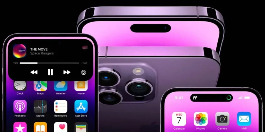
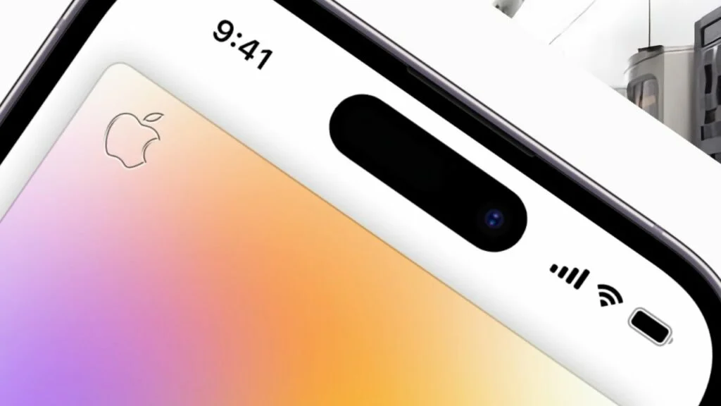
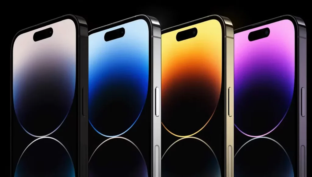
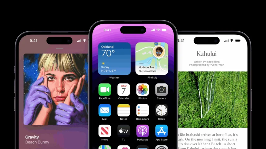
The much-anticipated design update has finally arrived with Apple’s newest iPhone 14 Pro series, five years after the notch debuted. Currently, Dynamic Island, a new pill-shaped cutout, is housed at the top of the show.
But what exactly does Apple’s Dynamic Island do? What distinguishes it from the iPhone 13 Pro’s notch? The most crucial question is whether or not buying the iPhone 14 Pro is worthwhile. Let’s find out.
Apple’s Dynamic Island Feature

From the iPhone 14 Pro and iPhone 14 Pro Max, the new pill-shaped cutout is referred to as Dynamic Island; it is regrettably absent on the iPhone 14 and iPhone 14 Plus, which still have the traditional notch. When you first see the cutout, you could assume that it is only decorative. It’s pretty practical, even if that is one of the reasons.
Beginning with the front camera, a new 12MP f/1.9 sensor with auto-focus and 38% improved low-light performance is housed in the cutout. The iPhone 14 Pro now can handle uncompressed photos using Apple’s Deep Fusion technology when coupled with the brand-new image algorithm known as Photonic Engine. Combining all of these factors makes it possible to capture selfies with brighter colors and greater detail.
The ability of Apple’s Dynamic Island feature to nimbly change into various forms to display a variety of glance-able data, though, is possibly its most striking feature. For instance, when you turn on quiet mode on your phone, plug in your Air Pods, use Face ID, or plug in your charger, the cutout will enlarge and show the activity before returning to normal.
The cutout will also remain extended until the conclusion of any background activities that are running, such as calls, playlists, podcasts, or timers. Better multitasking is made possible by the ability to long-press it to explore choices or tap it to access the app.
For instance, the cutout will enlarge to reveal the caller and give you the choice to accept or reject it if you receive a call while browsing through your Instagram feed. The cutout will remain extended as you answer the phone and remain so during the conversation. Long-pressing the cutout will bring up a menu with choices to end the conversation, switch to FaceTime, silence yourself, and more.
Similarly, if you’re listening to music while reading an e-book, you can long-press the cutout to get choices to halt the song, forward or rewind it, or navigate to a specific section of the song. Moreover, the iPhone 14 Pro’s Dynamic Island will create a new circular bubble next to the pill-shaped cutout if several background processes are running at the same time. You can do all of this within the app you’re using.
Can a Hole-Punch Cutout Replace the Dynamic Island?

Let’s start by stating the obvious. Yes, whether viewing films or playing games, the Dynamic Island on the iPhone 14 Pro is more obvious and possibly intrusive. The hole-punch cutout is advantageous from a strictly aesthetic standpoint since it is cleaner and simpler to overlook. Apple’s Dynamic Island, however, makes up for its lack of visual appeal with functionality.
The usefulness of this Dynamic Island will increase as more third-party developers modify their applications to make use of the new cutaway. Furthermore, it is quite doubtful that an Android phone manufacturer would be able to replicate this design as successfully and fluidly as Apple.
Why? Since iOS software is proprietary, it is more difficult for app developers to modify their programs to work on every Android phone, compared to iPhones. You should think about purchasing the iPhone 14 Pro because of what makes Apple’s Dynamic Island so unique.
The iPhone’s New Face Is Dynamic Island

Indeed, the Dynamic Island on the iPhone 14 is not a significant improvement over the notch, but it is also not a novelty feature. Its large size is made up for by the flowing animations that surround the pill-shaped cutout, which also makes it simpler to multitask and glance at glanceable information.
That doesn’t imply multitasking is any simpler on iPhones right now than it is on Android phones. The cutout feels more like an intentional design choice than an issue since Apple’s implementation of Dynamic Island is so flawless, though, and you don’t need to visit the notification panel that frequently.


